
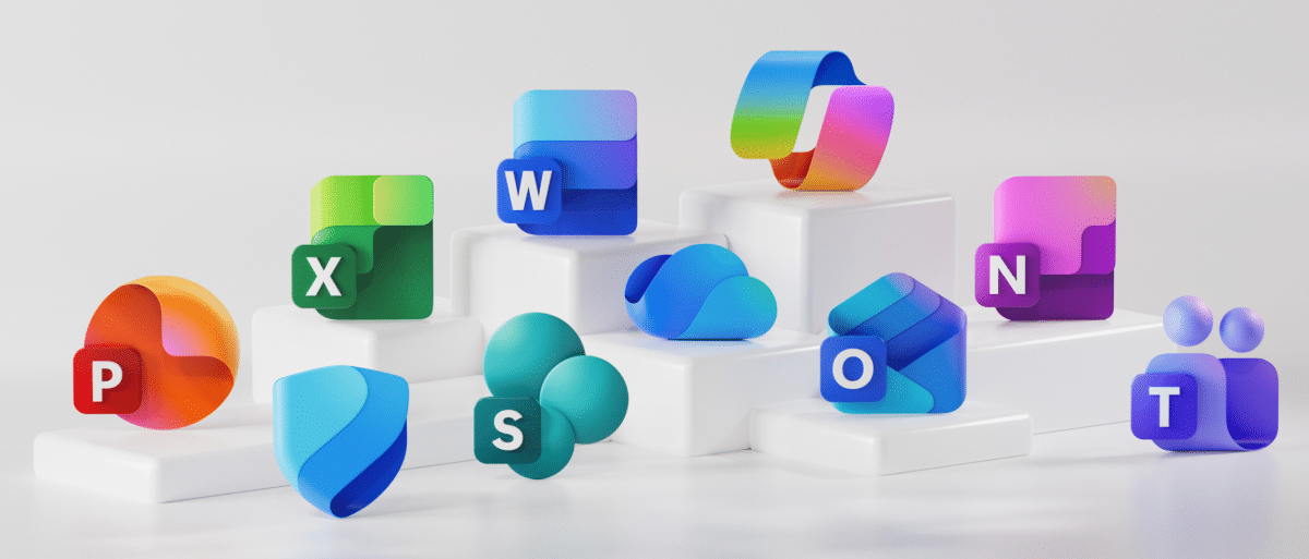
If you’ve been paying attention with the way things look in your start menu and in your documents folder, you may have noticed something: Your Microsoft 365 application and document icons have been tweaked. Microsoft recently went through a redesign of their app icons to make things consistent across all their platforms. You can read their full write up on their website that describes how they refreshed the Microsoft 365 icons with fluid forms and vibrant colors to reflect a deeper shift in design philosophy toward clarity, accessibility, and modern aesthetics.
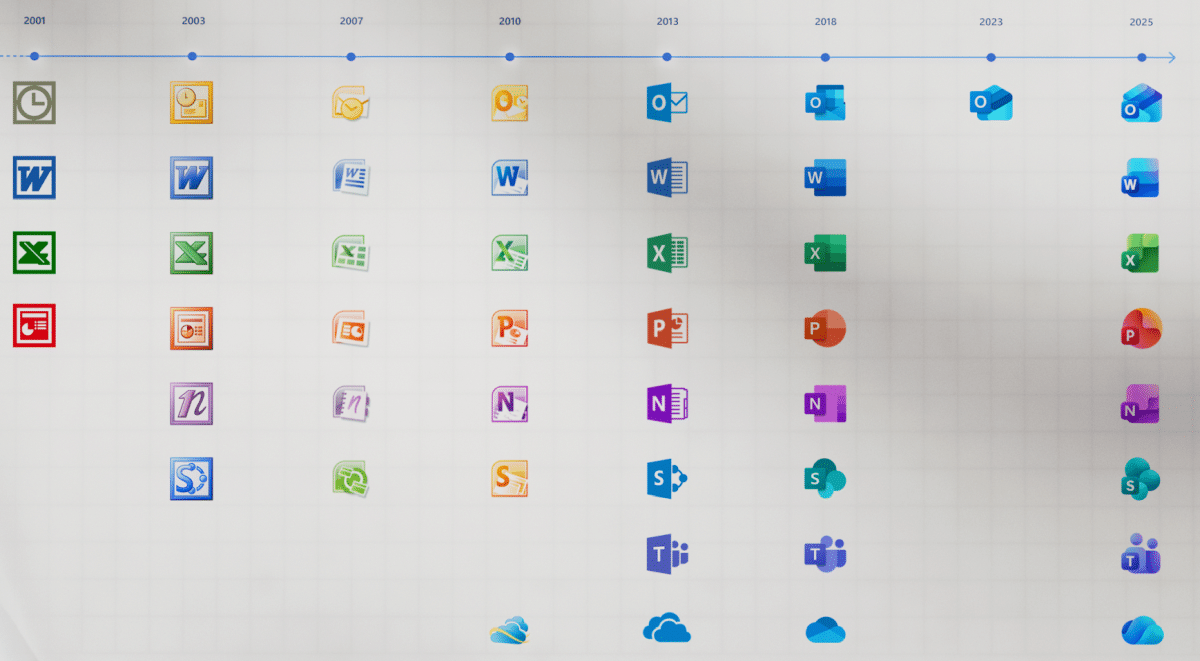
You can see the full timeline of the app icon changes over the years below:
They have also changed the icons for the various document formats the programs use. That’s all well and good, but there is a slight problem if you use OneDrive (which you should). OneDrive puts a little checkmark on the document if that document has synced up to OneDrive. The problem is that the program icon is being covered by that checkmark. This doesn’t affect you if followed our tutorial to enable thumbnail icons, as that moves the program icon to the other corner of the icon for some reason. See below:

While it’s still fairly obvious what program is going to open the file (especially if you have file extensions turned on like us nerds do) but it is slightly inconsistent. They’ll likely (hopefully) clean that up in a later update.
What do you think of the new icons? Throw a comment down below.
Images (mostly) courtesy of Microsoft.